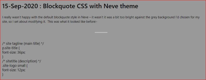
I wasn’t at all happy with the default blockquote style in Neve – a grey panel against a the grey background I’d chosen for my site just didn’t look very good, so I set about modifying it. This was what it looked like before:-

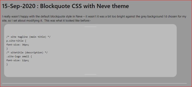
I think you’ll agree that the contents of the blockquote don’t particularly stand out, and since I’m quoting (if you can call it that) VBA, PHP or CSS code most of the time, it really needs to stand out a little more, and that a fixed-width font would be more suitable. I don’t mind admitting it was a bit of a struggle as my CSS isn’t very good, however Google eventually managed to throw enough snippets in my directiom to allow me to put together a stack by repeated trial and error which gave me a slightly better-looking result:-

If only I could work out how to get rid of the wide top and bottom margins, that would improve it a lot more, but I think they’re put there by the theme’s PHP files. I may try messing about with those when I get a moment, so if you’re looking at this post and the following code doesn’t have wide top and bottom margins like the example above, that means I’ve succeeded. On the other hand, if the entire site’s been down, it means I managed to break the PHP!
blockquote {
max-width: 880px;
text-align: left;
margin: 0px;
padding: 12px;
font-family: Consolas,Monaco,Lucida Console,Liberation Mono,DejaVu Sans Mono,Bitstream Vera Sans Mono,Courier New;
font-size: 12px;
line-height: 20px;
color: #000000;
background: #bbbbbb;
left: 10px;
right: 76px;
top: -12px;
bottom: 0px;
position: relative;
border-top: 0px solid #000000;
border-bottom: 0px solid #000000;
border-left: 0px solid #000000;
border-right: 0px solid #000000;
border-top-right-radius: 20px;
border-top-left-radius: 20px;
border-bottom-left-radius: 20px;
border-bottom-right-radius: 20px;
}
There are a lot of settings in there which don’t appear to have any effect and don’t need to be there, but I tried modifying most of those options in various combinations in an attempt to get exactly the style I wanted, so I’ve left them in for the sake of completeness. Well, not actually completeness, but they were all the ones I managed to find out about.
I’m not sure if they’re specific to Neve – I suspect not – so they may work for you using different themes. Let me know either way and I’ll update this page.
And if you do manage to fond out how to get rid of the wide top and bottom margins, please let me know by filling out this contact form or by emailing me. I’ll do my best to reply.