I came across a Web site recently which was so bad it made me wonder whether it had deliberately been designed badly or whether the designer really didn’t know what they were doing. This led me to put together a short list of some of the worst ‘sites for sore eyes’ I could find. They’re almost all as bad as each other, so they’re not in any particular order in the list. You might need to spend a few moments looking around each one to get a full appreciation of it, but I’m sure you’ll find most of them… what’s the word I’m looking for… ‘entertaining’?
 The Mercia Tourist Board – oh come on… I mean… come on! Is this even serious? The first link I clicked (“Sammy” – left) gave me “I can’t reach this page” and the second one (“British Eye”) led me to a page which promised to bring me “the best deals of Jewish Life in one place”. Eh wot? Other links are broken or lead to unexpected places, there are spelling and grammatical errors. When I scrolled down to my part of the country, the image was missing and there was no link to follow, and navigating methodically around the site was beyond me. Perhaps most disappointingly, scantily-clad females were used extensively and out of context – for example, why are there sections called “Sexy Gabriella Sabatini” and “Knickers Whoops” and series of photos featuring Steffi Graf’s and Chris Evert’s panties?
Bella de Soto’s Web site – wow… what can I say? Even if you zoom right out, you’ll struggle to fit the entire width of the home page in your browser window. There’s lots to get through, so if you have a few moments to spare, dive in and enjoy. Just be sure to turn your sound off before you click the link and only bring the volume up very, very slowly.
Mrs Ling’s Cars – a totally serious Web site, as a quick Google search will confirm. Choose from a fantastic range of cars to lease, such as a BMW i8 Convertible for just £1666/month or a Nissan GTR-R Coupé for £1457/month. There’s a slightly strange background sound track which plays automatically but at least it isn’t as loud as Bella de Soto’s. Perhaps the designer was going for ‘kitsch’ – who knows?
 Cloud 9 Walkers (i.e. horses) – a good example of someone who has no idea how to design a user-friendly site despite, presumably, having seen a few themselves. If you’re going to dump so much content on to a single page that it takes more than eighty PageDown key presses to get to the bottom (in one case), at least have the courtesy to place the navigation menu at the top. Everything conspires against with this one: the blue-on-blue Times New Roman (bold) against the busy cloud background (sometimes tiled, sometimes stretched), the occasional Comic Sans and Arial (sometimes bold, sometimes not), some Courier (by the looks of it), random italics and all-uppercase, the sudden appearance of Algerian font (as if the designer couldn’t be bothered scrolling down the list of fonts past the A’s), inconsistent backgrounds from page to page, more cheesiness in the form of animated GIFs (dancing horses, elephants, fireworks, flags, strobing rainbows, dogs with waggy tails – you get the idea), strangely-aligned photos, broken links, motorcycle pics (for some reason), and so much more. It’s a real shame because these people obviously love their horses and there’s so much good content available, but the task was evidently beyond their skills and the whole thing is a total mess. I wonder if they’re aware?
http://arngren.net/ – Norwegian online ‘technology & gadgets’ shop. As messy as the last site but unlike it, there’s at least an index/menu (top-left if you don’t spot it immediately) and below that a search box which may (or may not) make it easier to find what you’re shopping for. As far as I can tell this is a genuine site but I don’t vouch for it in any way, so you might (or might not) receive anything you order and pay for.
 The owner of this site invites you to ‘steal this banner to link to www.libertyvan.com‘, so I did. Another mish-mash of text in various fonts, sizes and colours, and images, some of them overlapping so it’s difficult to read and all of it over a tiled background of a cloudy sky. What is it with a cloudy sky?! If you’re interested, the designer of this site states she has been working as a “Web and graphics design and computer consultant” since 1997 and is “willing to do occasional graphics or Web design work”. Tempted?
Best Electronics (California) – why would a company specialising in IT services produce a Web site which looked as though it had been designed in the early 90’s by throwing the content into the page with a large shovel and then randomly splattering different colours and highlighting throughout it and inserting images which add no value. Before you ask, the home page appears to have been updated only two years ago. However what surprises me the most is that the hit counter at the time of writing is over a million – 1130570, in fact – so maybe it really has been going since the 90’s!
 Jami Lin’s site – I originally told myself I wouldn’t be including any sites belonging to wacky, new-age types – the sort of people who push astrology and encourage you to activate your inner rainbow by purchasing stuff from them at silly prices – because quite honestly they’re easy targets. But then I came across this site and it really does tick all the boxes. There’s the annoyance of links opening in new tabs, even ones within the same site, some links are broken or go to lapsed domains, others don’t go where they promise, font sizes are inconsistent, layouts are inconsistent, background colours change from page to page and colours clash badly throughout – which is ironic as she claims to teach ‘color alchemy’. There are buttons which float for no reason, the graphics are extremely cheesy, it’s very difficult to follow a sensible path around the site… I could go on. I’d be amazed and disappointed if this woman actually makes a living from doing what she does, but if that is the case, perhaps she could throw a couple of hundred dollars at a half-decent Web designer and at least pretend she believes all this nonsense herself. Failing that, perhaps some music playing in the background would improve matters…
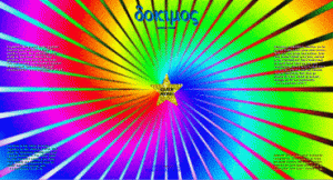
Start from http://www.dokimos.org/ or http://www.dokimos.org/ajff/ with this one. Why? Just… why? Is this a joke of some sort? Was the designer really proud of this site or has it been hacked by atheists? I couldn’t stand it for more than a few seconds but please feel free to check it out yourself to confirm it’s worthy of inclusion in this list. Some form of protective eyewear is advised. And maybe therapy afterwards.
And finally, I have absolutely no idea what’s going on at http://www.cyberdsignclan.com/. They’re apparently “a real business”, part of an “expert HTML Webring” and members of the HTML Writers Guild. Their contact page has been ‘under construction’ for as long as I can remember (how difficult can it be?!) and I’m apparently “visitor number 42 to this Web sight”. The meta elements in the home page’s <head> HTML suggests very strongly that despite their claimed HTML expertise and membership of the HWG, the entire sight may have been designed using “Microsoft Word 9”.
I haven’t archived any of the above sites, so if the owners redesign them after I post this, you may find yourself at the refurbished site with the original lost for ever. If this is the case, or if any of the links prove to be dead, please fill out this contact form or email me and I’ll fix them as soon as I can.
And if you’re familiar with any truly dreadful sites – or you think you can design one to compete with the ones I’ve discovered – I invite you to send me the URL, either by completing this contact form or by emailing me, and I’ll include them in my next list with an acknowledgement to you.